![]()
By Josh Lehner
Oregon Office of Economic Analysis Blog.
A common discussion in recent months and quarters has been the impact, or lack thereof, of the federal sequester. For the most part employment continues to grow nationally in the 150-200k range each month and while GDP has been sub-par, there generally haven’t been too many direct things one can point at and say the sequester is impacting it. On top of this remains the fact that most Americans do not know whether or not the sequester is a good or bad thing for the country. Well, if you dig a little bit deeper into the numbers, as the New York Times’ Catherine Rampell has in recent months, you can see clear signs of the sequester’s impact. Both in the public and private sectors. Ms. Rampell has been doing the best analysis I’ve seen out there on this and I have directly borrowed one of her graphs and one of her research ideas below.
First there is the federal workforce. Two direct impacts are seen in the data here: actual employment reductions and more part-time workers due to furloughs. Both of these items have direct labor market and economic impacts as they result in less wages and less jobs immediately. Employment cuts at the Department of Defense averaged 1,200 per month in 2012 yet that has accelerated to 2,500 in the 3 months since the sequester officially has been in place. Across other federal agencies (excluding hospitals and the postal service) the cuts have accelerated even further, from 1,600 in 2012 to 5,100 in recent months.
The second graph below, borrowed from Ms Rampell’s blog post the other day shows the dramatic increase in part-time federal workers for economic reasons (i.e. furloughs). All through 2013, these workers have been larger than in recent years and in June there were 3 times as many as in 2011 and 2012 and in July it was nearly 4 times as many.
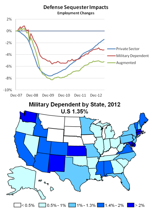
In terms of the private sector, the impacts are a bit more hidden given that the government buys goods and services from all types of firms so isolating the impact can be difficult. One way to do this, as Ms Rampell did in an article back in June, is to look at the industries that are most reliant upon military spending. This is important because half of the sequester was supposed to be defense spending cuts and the other half nondefense cuts. Ms Rampell relied upon an old 1998 BLS research article that identified military spending by industry. She then looked at the top 5 industries, which are Aircraft Manufacturing, Electronic Instrument Manufacturing, Facilities Support Services, Scientific Research and Development and Ship Building. These five industries are labeled military dependent.
Furthermore, given the details provided in the BLS report, one go further in terms of jobs by industry and I augmented the totals with three additional industries: Other Fabricated Metals (ammunition), Communication Equipment Manufacturing and Semiconductor and Electronic Component Manufacturing. The employment patterns since the recession started are shown in the top graph below. I have scaled the employment by sector based on the military dependent share identified by either Ms Rampell or BLS. The military dependent and augmented military dependent sectors exhibit the same general pattern over the recession and expansion, however the augmented sector shows larger job losses given that it includes a larger share of manufacturing workers which tend to be more cyclical than other industries (particularly to the downside).
The slowdown in employment in the military dependent industries begins in November 2012 and employment has stagnated since, even down a couple thousand yet no substantial job losses, at least not yet. However there has been a clear change in employment patterns in the industry since the threat of sequester became 100% real at the end of 2012.
Finally, the map above illustrates the Top 5 military dependent industries by state, as a share of the local workforce. Note that these are not scaled based on the military percentages, however the same regional and state patterns remain. Specifically for Oregon, we are not very federally reliant either in terms of direct employment, grants and spending or military contracting as many other states. However, all of our neighboring states are. Washington is ranked number 1 in terms of share of employment reliant on military dependent industries (and 2nd in outright job counts) while California is ranked 14th in percentage terms, yet 1st in terms of job counts. Even as the federal sequester may have a somewhat muted direct impact on Oregon, it won’t on our neighbors and Oregon’s economy does follow the U.S. economy overall so any slowdown nationally we would expect to feel locally.
All told, as seen above, there certainly are sequester impacts in the employment data, in both the private and public sectors.
Disclaimer: Articles featured on Oregon Report are the creation, responsibility and opinion of the authoring individual or organization which is featured at the top of every article.


