![]()
County Population Forecast
By Josh Lehner
Oregon Office of Economic Analysis Blog.
Just a quick update on inflation in Oregon and a interesting new way to illustrate the changes in the different components. (HT to the Federal Reserve Bank of Atlanta for the graph idea)
First a few primers on local inflation measures:
- No statewide CPI data available from BLS, just for the Portland-Salem CMSA
- Available on semiannual and annual basis, not monthly or quarterly
- CPI-U is for all urban consumers – about 88% of the population – and designed to reflect the average consumer’s spending patterns
- CPI-W is for urban wage earners and clerical workers – about 29% of the population – and designed to reflect the average worker’s spending patterns, which are different than the population at large
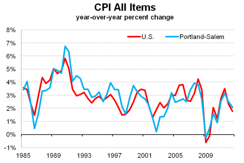
The semiannual frequency means there are only two data points each year: one for the January-June period and one for the July-December period. In terms of how local inflation tracks national trends, the follow graph illustrates CPI-U, the most commonly cited inflation statistic, since 1985. Overall inflation in the Portland-Salem CMSA closely follows the U.S. average over the past 27 years, although local inflation was a bit higher in the 1990s than the U.S. and a tad lower during the 2000s.
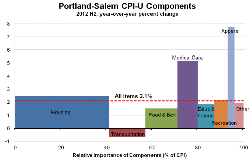
Now, a common refrain that is always out there is that the official inflation measures are too low. Have you seen the prices at the grocery store or at the pump?!?! Well, food and energy prices are more volatile than the majority of the other components in the CPI, but food and energy aren’t the only products or services we buy. The CPI basket of goods weighs the relative importance of different expenditure categories when arriving at the headline inflation figure. For the latest inflation reading in the Portland-Salem CMSA – the second half of 2012 – the graph below illustrates how each of these majority categories have changed over the past year. The height of the bars shows the price change over the past year while the width of the bars shows the relative importance – or weight – that each component has to the overall CPI basket of goods and services.
The weights themselves for Portland-Salem are from the latest U.S. Bureau of Labor Statistics publication I could find (see pg 9 of the PDF) and I think this graph provides a really neat, easy to understand summary of both the changes in prices and how the headline CPI figure is calculated. Again, thanks the Atlanta Fed for coming up with the graph.
I’ll leave to the side, for now, commentary on what is driving each of the changes seen in the graph. For more information on local weights relative to U.S. weights, plus much more on the CPI history and uses, please see this great article that state employment economist, Nick Beleiciks, wrote last year over at Employment.
For those of you more interested in the CPI-W, which is is sometimes used in COLA calculations, the corresponding graph looks like the following for the second half of 2012.
Data for the first half of 2013 will be released around the middle of August 2013.
Finally, there are a number of different measures of inflation, or price changes, available at the national level. There is headline inflation, core inflation, core pce, gdp deflator, trimmed mean inflation, median inflation and the like. Calculated Risk tracks a number of these measures on a regular basis and the latest graph can be seen following the link.
Disclaimer: Articles featured on Oregon Report are the creation, responsibility and opinion of the authoring individual or organization which is featured at the top of every article.


