![]()

Federal Expenditure by Region
By Josh Lehner
Oregon Office of Economic Analysis Blog.
A common refrain one hears goes along the lines that the U.S. subsidizes rural areas and living, while the metro areas generate more in tax revenue than they receive in benefits, or something along those lines. There are multiple components and questions that go into such a statement: where does the revenue come from, where is the money spent, on which types of programs, are their “makers” and “takers” when looking at revenues minus expenditures, are we looking strictly at actual revenues and expenditures or are we debt financing some, etc. I do not have an answer to most of those, but what I do have are federal expenditures by type on a regional basis.
The following is based on a recent inquiry to our office and I have tried to produce a few summary graphs and maps. All the data comes from the Census Bureau’s Consolidated Federal Funds report however I am using the USDA’s categorizations of the data. Unfortunately Census program was terminated last summer and the latest data is 2010. This is my first real foray into this data so if you are more familiar with it and have good insights I am missing, please let me know and I will update. A complete set of slides, including more information and figures, is available here in PDF format: USDA Federal Expenditures 2010.
First a few caveats. The actual level of federal dollars does follow the population centers and in Oregon that means the Willamette Valley, in order to view regional differences I calculate all of the following on a per capita basis. I have also subtracted out direct federal wages and salaries. Oregon does not have much of a federal employment footprint, but to try and get at the underlying spending I am leaving out these employees’ direct wages. Finally, there are some issues with assigning all of the money to a specific county. About 6-7% of the money flowing to Oregon in 2010 was unallocated to a specific county, so there are slightly different numbers when looking at the statewide total compared with the county sum. Furthermore, it does appear that Marion county is pretty high on the list for a number of categories and I suspect that some of this is due to federal dollars transferring to Salem that state government would then redistribute across Oregon, but in the data counts as Marion dollars.
With all of that being said, per capita federal spending in 2010 looks like the following. Effectively, the counties that are green are above average in terms of spending per capita, yellow and blue counties are average, while orange and red are below.
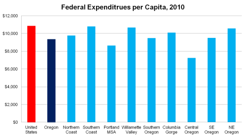
The next graph looks at the same data but strictly on a regional basis. There are some variations across the state when looking at total federal spending, but not much, or at least not as much as I had suspected going in. The exception being Central Oregon, which is a third lower than the national average. The only real variations are that the South Coast, Willamette Valley and NE Oregon are a little bit higher, while Portland is lower. As we’ll see there are some clear reasons for this. Again, overall I think this federal expenditures per capita is consistent across regions, even if individual counties do vary a bit more.
The majority of the spending is in Income Security. At the national level, 54% of spending is in this overarching group while in Oregon it is 60%. Income Security includes medical and hospital benefits, public assistance and unemployment compensation, retirement, disability and survivors social security payments. In terms of how large each of these components are, in 2010 about 1/3 of Income Security was for the medical and hospital benefits (likely medicaid and possibly medicare), 1/6 for assistance and unemployment benefits, and 1/2 for retirement, disability and survivors social security. Spending in these components can be driven by different variables including, income levels, poverty rates, economic conditions and demographics. The larger metropolitan areas have higher per capita incomes, which result in lower per capita spending on need-based or income-based programs. Unemployment benefits largely reflect local economic conditions (which do impact income levels as well). Finally, retirement and social security payments reflect demographics and as some of Oregon’s rural areas are aging fastest (partially due to younger age groups moving away), on a per capita basis these payments are higher. I believe these factors can be seen in the regional differences below. Portland has the lowest per capita Income Security payments and it is not because they don’t have low income individuals, or unemployed individuals or old people, it’s that these populations make up a smaller share of the overall population than in other areas. Conversely, the Southern Coast has lower per capita income levels and the most pronounced demographic change in the state, resulting in higher per capita figures for Income Security.
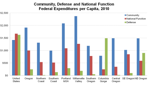
In terms of the non-Income Security expenditures, the graph below shows per capita payments for Community, National, and Defense. Defense (it also includes Space) is probably the easiest to explain and overall Oregon does not receive much in the way of defense spending compared with the rest of the country. We do not have a large military presense in the state, however we do have some defense contractors in the Portland region, but particularly in the Columbia Gorge and then the higher levels of spending in Northeast Oregon is likely related to the Umatilla Chemcial Depot. National Function spending is for items like law enforcement, energy, higher education and all other spending. In Oregon the majority of this money is for higher education, which goes to Portland and the Willamette Valley given that is where the larger universities are located. Community consists of business assistance, regional development, environmental protection, housing and transportation. Again, the majority of these funds are in Portland and the Valley. 78% of the Community funds were related to housing with nearly 90% of this going to guaranteed loans for mortgage insurance. A couple of notes on this: it would be interesting to see how much this changes over time, given that the mortgage market today is effectively all government loans with the private market still not back very much and second, high spending on these in the Valley and Portland is not that much of a surprise given homes in these ares tend to cost more than other regions of the state, on average. Another 15% of Community funds were for transportation projects, mostly highway work.
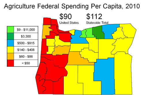
The last category presented here is Agriculture. Oregon receives a bit more than the national average in terms of these expenditures. About a quarter of these payments in 2010 were for crop insurance, another quarter were in other assistance programs that support farms through various provisions when the harvest is poor or disaster strikes. Another quarter, approximately, goes to forest and land management which includes conservation work and wildfire funds, among others. The last quarter of these agriculture expenditures includes water and recreational resource programs. Given that the largest individual item within all of these groups is crop insurance, it is not surprising to see Oregon’s wheat counties rank highest. (Also the lower population counts in Gilliam and Sherman help with high per capita figures)
Finally, the last item of note is that all of the above refers to federal spending and does not discuss where the money comes from. If you look at the pattern of revenue collections they tend to follow where the higher incomes are. Higher income individuals and families pay higher tax rates and have larger tax bills, but they also buy more goods and services (for sales tax states) and tend to have higher valued homes (property taxes). Mixing apples and oranges a bit by bringing in state personal income tax collections as an example, but in 2010 the Portland MSA accounted for about 47% of the state’s population, 52% of the state’s adjusted gross income but 59% of its taxable income, as reported by the Department of Revenue. This, of course, ignores all the other fees, fines and taxes that are on a per transaction or per year basis (gas tax, e.g.) that are not income-contingent. Once you include these items, revenues are less of a function of income level but even still, more revenue tends to come from the larger metropolitan areas where incomes are generally higher.
A complete set of slides, including more information and figures, is available here in PDF format: USDA Federal Expenditures 2010.
Disclaimer: Articles featured on Oregon Report are the creation, responsibility and opinion of the authoring individual or organization which is featured at the top of every article.


