 [5]
[5]
By Josh Lehner
Office of Economic Analysis
The bad economic data is just now starting to roll in, helping to quantify some of the initial impacts of the coronavirus. Yesterday we got another round of initial claims for unemployment insurance from last week at both the U.S. and state level. This morning we got the March employment report for the nation. Neither are good, which is to be expected, but we also know these are just the tip of the iceberg of what’s the come in the months ahead as the data catches up to the reality of what’s happening.
First, initial claims last week set new records at the national and state level. The Oregon Employment Department reported that they received 92,700 initial claims last week. That breaks the previous record of 76,500 set the week before, which was basically triple the previous record set during the Great Recession. To be honest, it is hard visually to show these increases and to pay justice to the fact we’ve set records two weeks in a row. That fact gets lost in the charts. So I have switched from showing the weekly claims and below I show monthly initial claims. Obviously the point still stands, and thankfully the calendar aligns perfectly for looking at weekly data for March 2020.
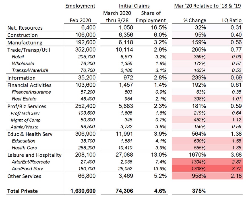
Now, we don’t yet have detailed information for all of these initial claims. Right now OED is able to provide sector and country breakdowns for the roughly 77,000 claims fully processed so far in March. See here for that detailed information including some nice Tableau visuals (good work Will BTW). I especially like the sector tree maps which are such an improvement over hideous pie charts.
Now, I’ve repurposed the data a bit in the table below to try and show the relative sizes and increases across sectors. Tables have no visual impact, which is why I’ve color coded it some, but they do serve an important purpose in terms of being a reference. The table focuses on the 74,000 private sector claims for which detailed data is available.
Claims are up significantly across all sectors. That said, as expected the biggest increases are seen in leisure and hospitality with bars and restaurants nearly shutdown. Other sectors impacted to a larger degree include retail, and other services which includes gyms, salons, social organizations and the like. Health care is also seeing large increases which at least anecdotally is tied to childcare services in addition to reductions in elective surgeries, dentist offices and so forth. The final column is a bit of a goofy concept but it takes a location quotient style calculation to try and adjust for typical industry churn, or level of UI claims compared to its industry size and how those have changed today relative to recent years. Larger numbers and darker reds are bad.
 [6]
[6]
The second big piece of economic data we received this morning was the national employment report for March. Simply put, March was one of the worst economic months on record. Payroll jobs fell 701,000 and the unemployment rate spiked 0.9 percentage points, rising from 3.5 to 4.4 percent. To be honest these figures were a lot larger than I expected for March. The reason is due to timing. Data collected is focused on the pay period that includes the 12th of the month. The thought was early/mid-March was too early to really capture the impacts of COVID-19 which really hit later in the month. But even with the bad March numbers, we know April will be even worse. We get the Oregon March report on Tuesday, April 14, and the April report on Tuesday, May 19th.
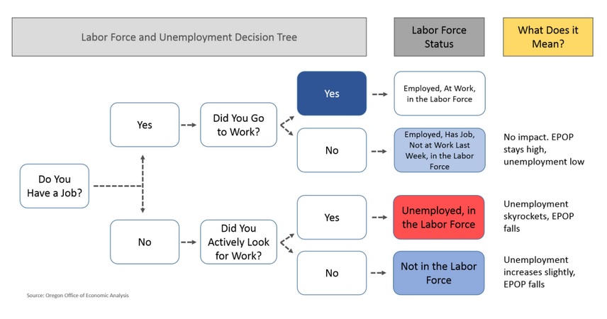
Finally, I want to touch on a technical data issue. I have been fielding a lot of questions about how high Oregon’s unemployment rate will increase. I don’t have any specifics to offer right now, other than to note we are working on our next forecast. Of course the answer is probably a lot, but there is actually considerable amounts of gray area. It really comes down to how Americans and Oregonians answer the survey questions. How do they categorize themselves during this bizarre time where you aren’t at work but probably have a job to come back to whether you’ve been laid off or not, and how then how do BLS workers code the answers?
The main possibilities can be seen in the flow chart below. Impacted workers will move from the dark blue “Yes” box to the light blue or red boxes, depending upon how they classify themselves. Do they still have a job, but are not at work? Are they out of work and still looking for a job? Or are they out of work and not actively searching because the federal UI changes waive the job search requirement?
 [7]
[7]
To be clear, the answers to these questions have no impact on the underlying economic conditions, which are terrible. However they can have a tremendous impact on what our standard economic data shows.
To this end, BLS has a great write-up [8] on how COVID-19 impacted the March data. They specifically noted that while they instructed their data collectors to code furloughed workers into unemployment, per standard procedures, the actual household survey did see a large increase in workers who had a job, but were not a work for “other reasons.” BLS noted that this increase was just as big at the unemployed increase, meaning the unemployment rate would have increased by nearly 2 percentage points, had they gone into the survey data and re-coded the responses, which they did not. This difference here in how individuals respond to the questions and how they are counted in the data is not trivial for our standard measures! Now the broader measures of unemployment, like U-6, should encapsulate these changes.
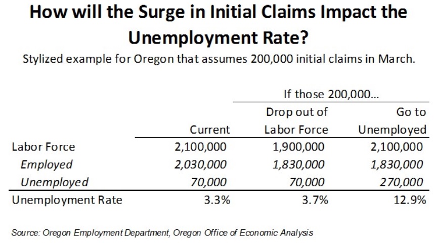
For these reasons, I have put together a highly stylized example for Oregon, although a bit different than the situation that arose in the national data this morning. In the table below I am calculating the unemployment rate if Oregon lost 200,000 jobs. If those workers transition from employment to unemployment then we would see the unemployment rate skyrocket. However if those workers transitioned from employment to not being the labor force, maybe because they no longer have to search for a job to receive the new UI benefits, then the unemployment rate would only increase a little bit.
 [9]
[9]
Please keep in mind that this is not a forecast for Oregon’s April unemployment rate. This is just a hypothetical that is designed to show how the data may shake out. There are always lots of individuals flowing into and out of the labor market all the time. Focusing just on initial claims can’t tell you the magnitude of the end results of the household survey, even if it gives a clear indication of where things are headed. We won’t know the final answers until we get the actual data and survey responses in the coming weeks and months.
I hope everyone enjoys their weekend. The good news is next week’s weather is supposed to be gorgeous for all of us.