![]() By Patrick Emerson,
By Patrick Emerson,
Oregon Economics Blog
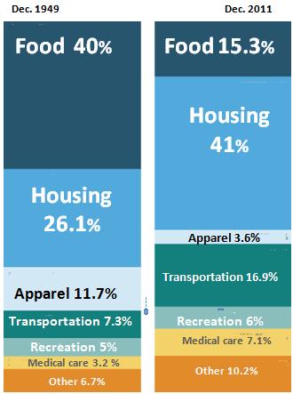
From NPRs Planet Money a fascinating graph showing percentage of income spent on consumption categories in 1949 and 2011:

(Source: Bureau of Labor Statistics Credit: Lam Thuy Vo / NPR)
What struck me immediately, of course, was the decline in the percentage spent on food. This is a function of both our increasing wealth and the massive productivity gains in agriculture. We spend more on homes and cars and health care.
The jump in spending on housing between 1949 and 2011 is also striking. It’s worth noting that people are buying (and renting) much bigger homes today. In 1950, the average new house was less than 1,000 square feet; in 2000, the average new house was over 2,000 square feet.
The rise in spending on transportation was driven by the spread of cars. In 1950, there were only three vehicles for every 10 Americans. By 2000, that had risen to eight vehicles for every 10 Americans.
But I expected a bigger jump in recreation as leisure is a big part of what we consume, but I suppose we would see that in the hours worked which is not a part of this.
Disclaimer: Articles featured on Oregon Report are the creation, responsibility and opinion of the authoring individual or organization which is featured at the top of every article.


