By Josh Lehner
Oregon Office of Economic Analysis Blog.

Checking in on employment across Oregon’s counties reveals a number of encouraging trends. First, in recent years, job growth has returned to all regions of the state. Every region and every single county has seen some gains from the depths of the Great Recession. That said, the growth has not been evenly distributed of course. Painting with a broad brush shows that urban Oregon has outperformed rural Oregon, even as the latter is now up to 80 percent recovered overall.
Second, the number of counties at all-time highs for employment continues to increase. Technically only 35 individual geographies are available in the data (CES) as the Salem MSA (Marion and Polk counties) is reported as one value.
Below is our office’s county bubble chart which shows how far each individual county fell during the Great Recession on the horizontal axis and then what share of jobs have been regained so far on the vertical axis. It looks like we haven’t shared this graph on the site in two years and wow, what a difference two years can make! (Note: My apologies. For the past 18 months housing and affordability have taken up much of my time, as you can tell. I have neglected much of the nuts and bolts regional work we used to provide. Of course, the Employment Department is always on top of local trends given their invaluable team of regional economists. I am currently updating our regional material and will post more frequently in the future.)
While just 16 areas (17 individual counties) are at historic employment levels, these counties represent 80% of all jobs in Oregon. That is, they include the larger, urban areas plus much of the North Coast and Columbia Gorge regions. If you include Lane County (Eugene) which is now 95% recovered, the total job share jumps to 87% of all job statewide.
For those counties and regions that are fully recovered and are now in expansion mode, the more important questions to be asked are about the quality of the jobs gained and whether or not growth is keeping pace with population and the like.
However, I want to spend a minute on some of the rural counties and regions that have yet to fully recover from the Great Recession and highlight some of their trends. Many of the light blue and orange bubble counties fall into two camps. While cold comfort and of little solace, it should also be noted that much of rural America has experienced clear losses in recent decades when it comes to both jobs and population. The fact that some areas of Oregon are seeing flat employment trends over this time, is both unfortunate that they are not sharing in the gains but also somewhat better than many parts of the nation.
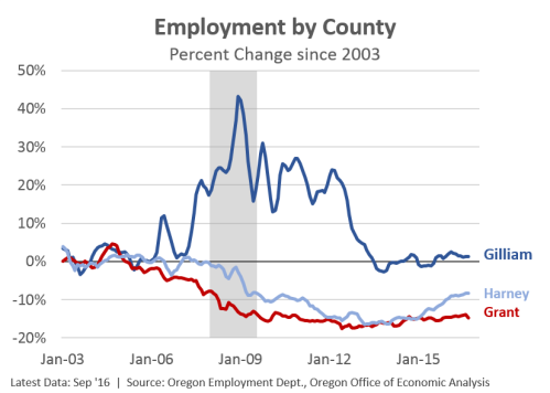
The first group includes counties like Grant, Harney and Malheur which have seen relatively flat or somewhat downward trends since the late 1990s. On the brighter side, Harney and Malheur have seen some solid job growth in the past 18 months but their longer term trends have been less robust. Grant is somewhat similar but the county’s trends have been longer (peak employment was 1992) and has yet to see any real upturn in employment thus far.
I have also included Gilliam in the next graph as the county is somewhat of an outlier, as you can see in the bubble chart. The county has seen flat trends for the past 15 years at around 750 jobs, however during 2007-12 period, employment increased to around 900, only for employment in recent years to return to around 750. I suspect that much of these changes coincided with wind farm construction. As such, the fluctuations are more due to temporary trends rather than the business cycle. If that is true, then the cold calculations used to create the bubble chart misrepresent Gilliam.
The second group of counties have also seen relatively flat employment trends since the late 1990s however they did experience some strong gains during the housing bubble. Employment in the counties shown below, but also include Baker, Lake and Lincoln too, are effectively back to early 2000s levels, but not back to housing boom peaks. These counties I plan on exploring further. How much of the mid-2000s gains were temporary or due to the bubble phenomenon, including stronger population and migration flows? How much of the bust and recovery so far represents fundamental, structural changes in the economy vs. a return to pre-bubble patterns? The economic trends in these counties do differ from the rest of the state and other rural areas and certainly worth learning more. 
Disclaimer: Articles featured on Oregon Report are the creation, responsibility and opinion of the authoring individual or organization which is featured at the top of every article.


