![]()
By Josh Lehner
Oregon Office of Economic Analysis Blog
This Graph of the Week is an update on the Oregon spider chart. See here for more on the construction of the graph which follows the pioneering work by the Atlanta Fed at the national level. As a reminder the chart tracks progress across a wide variety of labor market indicators. As each measure improves from its recessionary trough (the red dot, 0%), the line moves outward from the center. Once the measure reaches the gray, dotted line, that indicates it has fully regained the level (or rate) last seen prior to the Great Recession. The two sentence takeaway is: Labor market leading indicators continue to improve and over the past year employer behavior has picked up nicely. However, employee confidence and utilization measures — the feel good nature of the economy — are still just about half-way back to pre-recession levels.
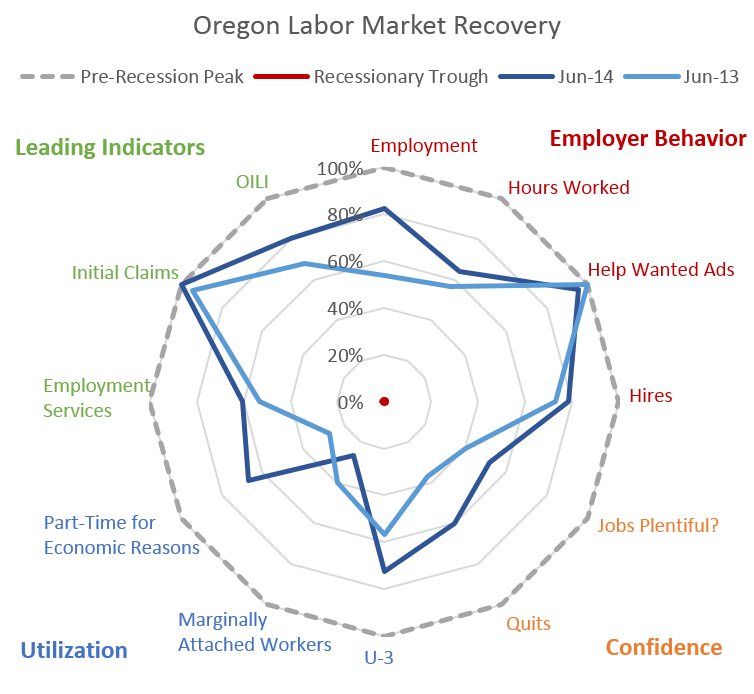
One minor tweak this round is the substitution of Marginally Attached Workers for U-6. U-6 is the combination of U-3, MAW and PT for Economic Reasons. Showing both of these additional components that make up U-6 provides a bit more detail to the underlying currents in the labor market. As such, one can see that PT for Economic Reasons has declined (improved) substantially over the past year (really the past 6 months), while those MAW have increased. We know that the decline in the unemployment rate has not been entirely for good reasons, with the labor force shrinking, some of these dropouts are likely showing up in the larger number of MAW (those who want a job but have not looked recently). So even as U-6 falls


Disclaimer: Articles featured on Oregon Report are the creation, responsibility and opinion of the authoring individual or organization which is featured at the top of every article.